Optimizing a Photography Studio Website for Converstion and SEO: The Analysis
edit ✏️The internet is a competitive place for small businesses, and this is especially true when we are talking about portrait photographers. My lovely wife is a family photographer in Fort Worth, Texas. She’s been doing portrait photography professionally since 2007, and being the good nerd husband I am, she’s had a web presence the entire time. By this I mean she’s had a website that I built in 2007 (prior to my own shift in careers from 3d animation to web development), and haven’t really touched since. She’s been left to her own devices, outside of my intervention when her Wordpress installation was “hacked” to be used for nefarious purposes (this is an entirely different post, ugh).
Fast forward to 2013. This year has been interesting for me professionally. I’ve become extremely passionate about conversion optimization and search engine optimization. Conversion optimization simply means converting website visitors into paying clients, and search engine optimization (SEO) is the art of climbing the Google ranks for organic search results. Our photography site is the polar opposite of being optimized for either of those things. My research on conversion optimization and SEO wasn’t focused on our photography business, at all. It is a weird instance of the “cobblers son has no shoes” where I wasn’t even considering our own business and how it might benefit from the techniques that I’ve been learning. In fact, in my moment of epiphany it occured to me that other photographer’s websites suffer in a similar fashion, so I decided to write a guidebook on conversion optimization and SEO for photographers.
I’m going to use my wife’s site as a case study, breaking it down and rebuilding it into a useful asset that not only attracts potential clients, but converts those visitors into high quality clients. Of the two, SEO and converstion optimization, the latter is infinitely more important. Even if you have killer placement in search results, or spend piles of cash to buy top placement with AdWords, if those visitors aren’t contacting you in some way, then your website is effectively useless. It is also a possibility that your website is attracting the wrong clients, like bargain hunters looking for discount photographs on the cheap. Visual Empathy’s website doesn’t do either, and the first step is to take a look at why this might be the case.

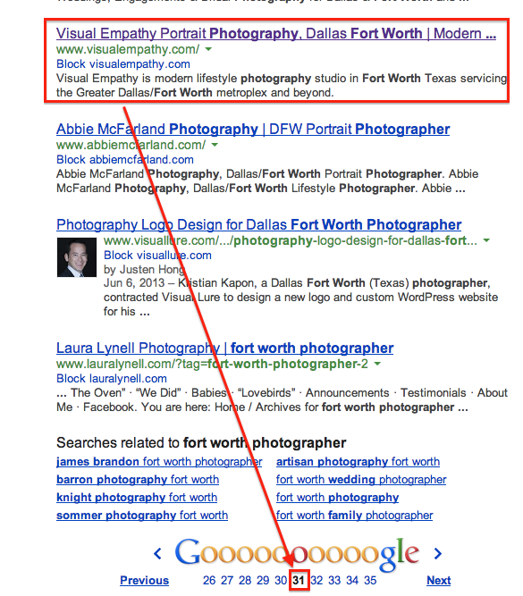
The above is a search for “Fort Worth photographer”, which is fairly generic. More specific searches don’t yield better results, unless you search for “Visual Empathy”. Thankfully we land at number 1 there, but anybody searching for your businesses name directly already knows about you.
We do have Google Analytics installed, so I can get some insight into what searches are actually displaying the website. If you are curious, I’ve put a full month of analytics data in this spreadsheet, but the top searches are:
- 4 month old baby
- 6 week old baby
- rubys
- 12 month old baby
- summer time photography
And the list goes on. Ugh. And to rub salt in the wound:
Normal web searches account for a tiny sliver of the pie. Images account for the overwhelming amount of search results where VE actually shows up. Searchers are looking for pictures of babies at certain ages. Only 0.75% of the total search results actually end up getting clicked through. I actually think this might be on the high side because there were some weird things in the data. The items that were clicked all showed 5 clicks. That seems strange, but the important thing is that nobody is coming to Visual Empathy’s website because they are looking for a local photographer. Of those that click through, exactly 0% actually convert to paying customers.
The silver lining? There is a lot of room for improvement.
In the next post in this series we will tear down Visual Empathy’s website and try to understand why we are getting these results on Google, and attempt to identify ways of improving them. As part of the series, Visual Empathy is going to get a complete web makeover. Top to bottom, back to front.